Building a Meeting Cost Calculator Designed to Go Viral
Most meeting cost calculators are static forms. I built one with a live timer, color progression, milestone alerts, and shareable result cards — designed to create screenshot moments people actually want to share.
In 2023, Shopify built an internal meeting cost calculator. It was a simple tool — enter the number of people, their average salary, the meeting length, and it spits out a dollar figure. Nothing fancy. But the idea behind it was powerful: make the invisible cost of meetings visible. The story went viral. CNN covered it. Bloomberg covered it. Fortune wrote about it. Shopify's CEO Tobi Lütke used it as ammunition to cancel thousands of recurring meetings across the company.
That story stuck with me. Not because the tool was technically impressive — it was a basic calculator — but because the concept was inherently shareable. Everyone has sat through a meeting that should have been an email. Everyone has felt their time being wasted. A meeting cost calculator gives you a number to attach to that feeling, and numbers are what make things go viral.
I analyzed over 20 existing meeting cost calculators online. Most of them are static: enter inputs, click Calculate, see a number. A few have a timer, but none of them combine the live ticking cost with visual drama and built-in shareability. That was the gap. I wanted to build a meeting cost calculator that people would screenshot mid-meeting and post to Slack, Twitter, or LinkedIn with a caption like "This one-hour sync just cost us $2,400."
Why Another Meeting Cost Calculator?
The existing landscape of meeting cost calculators falls into two categories. The first is the static calculator: you fill in a form, press a button, and get a single number. Harvard Business Review has one. Shopify's was one. They work, but they feel like a spreadsheet. There is no emotional punch. You see the number, nod, and move on.
The second category adds a timer. A few tools let you start a clock and watch the cost accumulate. This is better — there is something viscerally different about watching dollars tick up in real time versus reading a flat number on a page. But even the timer-based tools I found stopped there. No visual feedback as the cost climbs. No contextual comparisons ("that's the price of an iPhone"). No way to capture and share the result.
The gap I identified was the intersection of three things: a live timer that makes cost feel real, visual design that creates emotional escalation, and a shareable output that turns every meeting into potential content. No single tool combined all three. Most tools treated meeting cost calculation as a math problem. I wanted to treat it as a storytelling problem.
The goal was not to build the most accurate payroll tool on the internet. The goal was to build something that creates moments — moments worth screenshotting, moments worth sharing, moments that make people think twice before scheduling that next 30-minute "quick sync" with 12 people.
The Live Timer: Making Cost Feel Real
There is a fundamental psychological difference between reading "this meeting cost $1,200" and watching the number climb from $0 to $1,200 in real time. The static number is information. The ticking number is an experience. It creates urgency. It demands attention. And it gets harder to ignore the longer it runs.
The timer implementation uses setInterval at 250 milliseconds. I chose 250ms over 1000ms because a once-per-second update feels choppy — you see the number jump. At four updates per second, the cost display feels like a smooth, continuous flow. It is the same refresh pattern I used for the Pomodoro Timer, and it works well for any counter that needs to feel fluid rather than stepped.
For time tracking accuracy, the timer does not rely on counting interval ticks. JavaScript's setInterval is not precise — if the browser tab goes to the background, the engine may throttle intervals to once per second or even pause them entirely. Instead, I store the start time using Date.now() and calculate elapsed time by comparing the current timestamp against that stored value on every tick. This means the displayed cost is always correct, even if the user switches to another tab for ten minutes and comes back. The elapsed time is real wall-clock time, not accumulated interval counts.
One detail that proved surprisingly effective: displaying the per-second rate alongside the total. When you enter 8 people at $75/hour, the tool shows "burning $0.17/second" at the top of the display. That number is more visceral than "$600/hour" because seconds are immediate. You can feel a second pass. You cannot feel an hour pass in the same way. Framing cost at the per-second level makes the waste feel continuous and unavoidable, which is exactly the emotional response that drives sharing.
Color Progression: Emotional Design
A number that ticks up is engaging. A number that ticks up and changes color as it climbs is dramatic. I wanted the cost display to feel like a warning system — calm at the start, increasingly alarming as the cost accumulates.
The color progression works on four thresholds. Below $100, the cost display is a calm green. This is the "reasonable meeting" zone — a short standup with a few people. Between $100 and $500, it shifts to a cautionary yellow. You are entering territory where the meeting's cost is becoming nontrivial. Between $500 and $1,000, it turns to warning orange. This is an expensive meeting by any standard. Above $1,000, it hits alarm red. At this point, the meeting has cost more than many people earn in a week.
The transitions between colors are handled with CSS transition on the color property. Instead of an abrupt jump from green to yellow, the color morphs smoothly over 500 milliseconds. This creates a feeling that the display is alive — it is not just rendering data, it is reacting to it. The smooth morphing was inspired by Meeting Cost Ticker's red pulsing overrun indicator, which flashes when a meeting exceeds its scheduled time. I liked that concept but felt a single binary flash was too limited. Extending the color feedback across the full cost range means the display is always communicating something about the meeting's expense, not just whether it has gone over time.
The color choices themselves are deliberate. Green, yellow, orange, and red map directly to universal traffic-light conventions that every user already understands. There is zero learning curve. The first time someone sees the number shift from green to yellow, they instinctively understand: this is starting to get expensive. No tooltip or legend needed.
Milestone Alerts: The Gamification Layer
Color changes provide continuous emotional feedback. Milestone alerts provide discrete, shareable moments. When the meeting cost crosses specific dollar thresholds — $100, $500, $999, $2,499, $5,000, and $10,000 — a slide-in notification appears with a real-world comparison. The notification reads something like: "$999 — That's a brand-new iPhone!" or "$500 — That's a round-trip domestic flight!"
The comparison items were chosen for two qualities: cultural recognition and emotional impact. Everyone knows how much an iPhone costs. Everyone knows what a coffee or a burrito costs. By mapping meeting dollars to objects people buy with their own money, the abstract cost becomes personal. The milestone thresholds are: $100 (a nice dinner for two), $500 (a round-trip flight), $999 (an iPhone), $2,499 (a MacBook Pro), $5,000 (a used car down payment), and $10,000 (a home repair project). Each comparison was selected because it is something a wide audience immediately recognizes and can price intuitively.
Each milestone triggers exactly once per session. If the cost passes $999, you see the iPhone notification. It slides in, stays for a few seconds, and fades out. If the cost continues climbing past $999 and then falls back (which does not happen in practice, but the guard exists), the notification does not fire again. This prevents notification fatigue. If every dollar amount triggered a popup, the tool would feel like a spam machine. The once-per-session rule keeps milestones feeling like events rather than interruptions.
The gamification effect is subtle but powerful. Each milestone is a potential screenshot moment. In a long meeting, someone running the calculator might hit three or four milestones. Each one creates a reaction — a laugh, a groan, a message in the team chat. The tool is generating multiple moments of engagement throughout the meeting, not just a single number at the end. This sustained engagement is what separates a tool people try once from a tool people keep open for the full hour.
The Shareable Result Card: The Spotify Wrapped Effect
The entire tool was built around this moment: when the timer stops, the result needs to be worth sharing.
I studied what makes Spotify Wrapped one of the most successful viral campaigns in tech history. Every December, Spotify generates personalized year-in-review cards for its 200 million users, and within 24 hours, those cards flood every social media platform. The formula has three components: the output is personalized with your specific data, the visual design is ready for sharing without any editing, and seeing other people's cards creates FOMO that drives non-users to try it themselves.
I applied the same formula to the meeting result card. When the user stops the timer, a dark gradient card appears with the meeting summary: total duration, number of attendees, cost per person, cost per minute, and the total cost in large, bold text. Below the cost, a fun comparison line adds personality: "That's 103 cups of coffee" or "That's 2 iPhones." A verdict line with an emoji reaction adds a final punch — the tool auto-generates one-liners like "This is no longer a meeting. This is a financial event." At the bottom, a subtle sudotool.com watermark serves as attribution when the card gets shared.
The card is generated as a downloadable PNG using the Canvas API. No external libraries, no server-side rendering. The browser's CanvasRenderingContext2D handles the text layout, gradient background, and image export. I draw the dark gradient first, then layer the text elements with precise positioning. The final output is a 1200×630 pixel image sized for optimal display on Twitter, LinkedIn, and Slack previews.
Alongside the image download, the tool generates pre-written share text for Twitter/X and LinkedIn. The share text follows a specific formula: an emoji verdict, a concrete dollar amount, an absurd comparison, and a call-to-action. For example: "💸 Our 45-minute sync just cost $1,847. That's 1 iPhone. Calculate yours: sudotool.com/tools/meeting-cost-calculator." The comparison always picks the highest-value item that fits — so $1,847 shows "1 iPhone" rather than "319 coffees," because "you just burned an iPhone" hits harder than a large number of small items. The URL provides attribution and drives traffic back to the tool. Every element of the share text is engineered to maximize the likelihood that someone actually posts it.
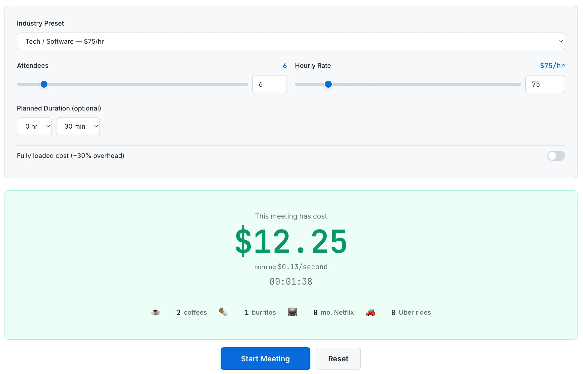
The live timer in action: $12.25 burned in under 2 minutes, with the comparison ticker showing 2 coffees and 1 burrito so far.
The Spotify Wrapped parallel extends to the FOMO effect. When someone shares their meeting cost card on LinkedIn, every person who sees it thinks: "I wonder how much my meetings cost." That curiosity drives them to the tool. They run their own calculation, get their own card, and share it. The loop is self-reinforcing. The tool's output is its own marketing.
What I'd Build Next
The current version of the meeting cost calculator is a standalone timer. But the concept opens the door to several features that would significantly increase its utility and retention.
Calendar integration. Connect to Google Calendar and automatically calculate the cost of every meeting on your schedule for the day, week, or month. No manual entry required. You would see a dashboard showing "You spent $4,200 in meetings this week" with a breakdown by meeting. This is the single highest-impact feature because it removes friction — most people will not manually run a timer for every meeting, but they would glance at an automated weekly summary.
Team dashboard. Aggregate meeting costs across an entire team or department. A manager could see that their 15-person engineering team spent $23,000 in meetings last month. Trend lines would show whether meeting costs are increasing or decreasing over time. This transforms the tool from a novelty into a management tool.
Browser extension for video calls. A small overlay that sits in the corner of Google Meet or Zoom showing the live cost ticker. This is where the tool's viral potential is highest — every participant in the meeting sees the cost, not just the person who opened the calculator. One person installing the extension turns every meeting into a cost-awareness event.
Meeting ROI scoring. After each meeting, the tool would ask: "Was this meeting worth its cost?" Over time, it would build a dataset of which types of meetings your team finds valuable and which ones are consistently rated as not worth the money. This data could feed into a "Should this meeting be an email?" decision framework that suggests canceling or shortening meetings based on historical ROI scores.
For a deeper look at the research behind meeting costs — including how Atlassian found that the average employee attends 62 meetings per month and considers half of them a waste of time — read our guide: The True Cost of Meetings: Why Every Minute Has a Price Tag.
The Takeaway
A meeting cost calculator is, at its core, a multiplication problem. Number of people times hourly rate times duration. Any spreadsheet can do that math. But a spreadsheet does not make you feel anything. It does not make you wince when the number crosses $500. It does not give you a screenshot-ready card to post on LinkedIn. It does not turn a boring Tuesday standup into a conversation about whether this meeting should exist at all.
The technical implementation is straightforward — setInterval, Date.now(), CSS transitions, the Canvas API. None of it is complex. What matters is how these pieces are combined to create an emotional experience around a simple number. The live timer creates urgency. The color progression creates escalation. The milestone alerts create moments. The result card creates sharing. Each layer builds on the previous one to turn basic arithmetic into something people want to talk about.
That is the lesson I keep learning with every tool I build: the technical difficulty of the feature matters far less than the emotional response it creates. A meeting cost calculator does not need to be complex. It needs to be dramatic.