Why I Built an Investment Growth Simulator When Every Bank Has a Calculator
The problem wasn't calculating compound interest. It was seeing what my money would actually be worth after fees, taxes, and inflation.
It feels like everyone around me is building something on the side these days. Side projects, stocks, ETFs, real estate — more and more people are looking for ways to grow their money beyond a regular paycheck. I'm no different.
And once you start, the same question always comes up: "If I put this much in every month, how much will I have when I retire?" Whether you're aiming for FIRE (Financial Independence, Retire Early) or just trying to plan for the future, the question is the same.
So I searched for "compound interest calculator." There were hundreds. But none of them showed me what I actually wanted to see.
The Problem With Every Compound Interest Calculator I Found
Most compound interest calculators on bank websites and finance apps follow the same pattern. You enter your initial investment, monthly contribution, interest rate, and time horizon. It spits out a single final number. That's it.
The problem is that number isn't real.
What about fees? Most funds and ETFs charge an annual expense ratio — anywhere from 0.03% to over 1%. Over 20 or 30 years, that small difference can cost you tens of thousands of dollars. What about taxes? When you realize your gains, capital gains tax takes a cut. What about inflation? A million dollars in 20 years won't buy what a million dollars buys today.
Most calculators ignore all three. So the number on the screen always looks better than reality. I wanted realistic numbers — what's actually left after fees, taxes, and the slow erosion of purchasing power. Not a rosy projection, but the real value.
And one more thing. Say you invest $500 a month for 30 years and end up with $500,000. So what? What can you actually do with that? How much can you spend each month? What's your daily budget? Almost no calculator I found answered that question.
What I Actually Wanted to See
Here's what I needed:
- A real-time simulation where moving a slider instantly updates the chart
- Realistic final numbers with fees, taxes, and inflation applied
- A FIRE estimate showing "with this portfolio, you can spend this much per month and per day" based on the 4% rule
- A volatility range showing optimistic and pessimistic scenarios side by side
- No login, no sign-up — just open the browser and start playing with numbers
Bank calculators hide behind login screens, and most are tailored to push their own products. Standalone online calculators tend to be too simple, or they ask for your email before showing results. I just wanted to open a page in my browser, drag some sliders around, and simulate my financial future on the spot.
What the Tool Actually Does
The Investment Growth Simulator starts with four basic inputs: initial investment, monthly deposit, annual return rate, and time period. Move a slider or type a number directly, and the chart and summary cards update in real time.
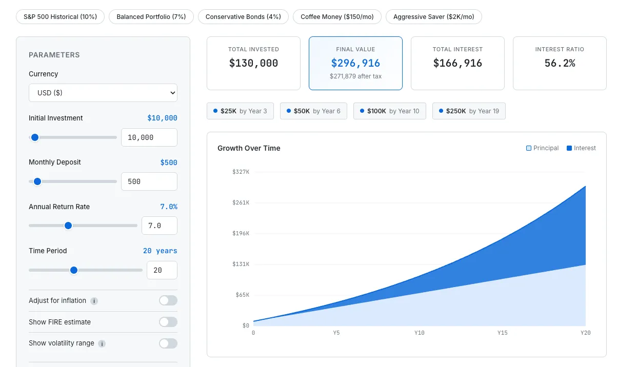
Simulating 20 years of investment growth with FIRE estimate and real-time chart updates.
Go one level deeper and the realistic factors kick in. Toggle inflation adjustment and your final balance is converted to today's purchasing power. Open the Fees & Taxes section to set an expense ratio and capital gains tax rate. The numbers shift — sometimes dramatically — and that's the point. It's easy to feel great about a projected $500,000 until you realize that after a 1% expense ratio and 15% capital gains tax, the number looks quite different.
Turn on the FIRE estimate and you'll see your projected monthly income, annual income, and daily budget based on the 4% rule. This was the most useful feature for me personally. "$500,000" is abstract. "You can spend $1,400 a month" is something you can actually feel. It's the difference between a number on a chart and an answer to "can I actually retire on this?"
The volatility range (Monte Carlo Lite) adds a shaded band to the chart showing optimistic and pessimistic outcomes. Real markets don't deliver the same return every year. This feature shows the range between the 10th and 90th percentile, giving you a much more honest picture than a single smooth growth line.
I also added preset buttons — S&P 500 historical returns (10%), balanced portfolio (7%), conservative bonds (4%), coffee money investing ($150/month), aggressive saver ($2,000/month) — so you can load common scenarios in one click and start exploring from there.
How It's Built — No Server, No API
This tool doesn't call a single external API. Every calculation runs in JavaScript, entirely in the browser.
The compound interest math itself is straightforward. Each month, the balance is multiplied by the monthly rate (annual rate divided by 12), the monthly deposit is added, and fees are subtracted. Repeat for the full investment period. Inflation adjustment divides the final value by (1 + inflation rate) raised to the number of years — converting future dollars into today's purchasing power.
The chart is drawn directly on an HTML Canvas element. I could have used a charting library, but I wanted to keep the tool lightweight with zero external dependencies. The volatility band is rendered as a shaded region on the same canvas.
User settings — saved scenarios, currency preference, toggle states — are all stored in localStorage. It's the same approach used across every tool on SudoTool. The Travel Currency Converter stores your spending list locally. The Running Weather Scheduler saves your city and run preferences the same way. No data leaves your browser. For a tool that deals with personal financial numbers, that felt especially important.
The tool supports eight currencies — USD, KRW, EUR, GBP, JPY, CAD, AUD, and CHF. Switching currencies automatically adjusts the symbol, locale formatting, and slider ranges so the numbers feel natural no matter where you are.
What's Still Missing
There are a few things I'd like to add.
First, a proper comparison mode. Being able to place two scenarios side by side — "how much does a 0.1% expense ratio vs. 1% cost me over 30 years?" — would make the impact of fees instantly visible. Right now you can save scenarios and compare manually, but a visual side-by-side would be far more powerful.
Second, a dividend reinvestment option. A lot of people invest in dividend stocks or dividend ETFs, and being able to set a separate dividend yield with a reinvestment toggle would make simulations more realistic for that strategy.
Third, a post-retirement drawdown simulation. The tool currently shows FIRE income based on the 4% rule, but it doesn't simulate what happens to the portfolio over time as you withdraw from it year after year. Showing whether the money actually lasts 30 years — or runs out in 20 — would be a much more complete picture.
Try It
An investment simulator isn't a replacement for financial advice. But a tool that answers "what happens if I invest $500 a month for 20 years?" in ten seconds, with a visual chart and realistic adjustments, is genuinely useful. At least it has been for me.
I'd suggest starting with the preset buttons. Load the S&P 500 historical return and then switch to conservative bonds — seeing the 30-year difference between 10% and 4% makes the power of compound interest hit differently when it's your own money on the line.