Why I Built a Fancy Text Generator When Dozens Already Exist
The problem wasn't a lack of tools. It was that every existing tool made a 10-second task feel like work.
Search "fancy text generator" and you get dozens of results. LingoJam is one of the most visited fancy text tools on the internet. YayText offers over 80 styles. The market is saturated. So why build another one?
Simple. I tried them all, and they all frustrated me.
I went to LingoJam to copy a cursive text for an Instagram bio. Fifty-plus styles dumped into the page at once. I scrolled to find the one I wanted, and when I finally found it, I had to drag-select the text and copy it manually. There was no copy button. In 2026. Between the styles, ads were sandwiched in — I accidentally clicked one while scrolling.
YayText was better in terms of UX. It had individual copy buttons. But with 80-plus styles listed one after another, it was an endless scroll. The sidebar navigation only worked on desktop. On mobile, it was just a very long page.
Users want exactly three things from this tool: type, find, copy. The whole interaction should take about ten seconds. But every existing tool was making the "find" step unnecessarily hard.
The Problem With Every Fancy Text Generator
I analyzed the top competitors one by one.
LingoJam — the market leader. Over 50 styles, but all results are dumped into a single output area. No per-style copy buttons, so users have to manually select and copy text. On mobile, that's nearly impossible to do precisely. Three or more ad slots are placed throughout the page, including a sticky adhesive ad at the bottom of the screen.
YayText — the cleanest competitor in terms of UX. Over 80 styles with individual copy buttons for each one. But there's no way to search or filter styles. You scroll through all 80 from top to bottom until you find what you need. No favorites, no categories.
The pattern across all of them:
- Focused on maximizing style count, while ignoring the experience of finding the right style quickly
- Ads placed above the tool, pushing it below the fold on first load
- Poor mobile experience — 50 to 80 styles on a small screen means a lot of scrolling
The problem was clear. The differentiator isn't the number of styles. It's how fast you can get from typing your text to copying the style you want.
40 Styles, Not 80
My first instinct was to include as many styles as possible. I researched every Unicode-based text style available — about 40 distinct styles from mathematical symbol blocks, enclosed alphanumerics, combining characters, and phonetic alphabets. With creative decorations and wrapping, pushing past 60 was possible.
But when I compared them side by side, many were nearly indistinguishable. Sans-serif looked too similar to regular text. Short Strikethrough was almost identical to regular Strikethrough — just a slightly shorter line. Double Underline looked like a bolder version of Single Underline.
I set one rule: "Can you tell it's a different style at a glance?" If a style didn't pass that test, it was cut.
The result was 40 styles across three categories:
- 28 Unicode styles — character substitution styles like Bold, Italic, Cursive, Gothic, Outlined, Small Caps, and Superscript. Combining character styles like Strikethrough, Underline, and Wavy. Enclosed styles like Circled, Squared, and Parenthesized.
- 6 between-letter decorations — Stars, Sparkles, Hearts, Flowers, Dots, and Diamonds. These are the most popular styles for Instagram and TikTok bios.
- 6 text wrapping styles — decorative frames like ꧁Hello꧂, 『Hello』, and 【Hello】. Popular for gaming usernames and Discord server names.
I'd rather have 40 styles where every single one is worth using than 80 where half look the same.
How Unicode Text Styling Actually Works
The output of this tool isn't a different font. It doesn't change the font at all — it replaces the characters themselves.
The letter "A" has a Unicode code point of U+0041. Bold "A" is U+1D400. These are entirely different characters in the Unicode standard, but Bold A happens to look like a thicker version of regular A. The Unicode specification includes a block called Mathematical Alphanumeric Symbols (U+1D400 to U+1D7FF) where Bold, Italic, Script, Fraktur, and other styled alphabets are defined as separate code points.
The conversion logic is simple offset arithmetic. Subtract the base code point from the input character, then add the starting point of the target style. For Bold: outputCode = 0x1D400 + (inputCode - 65). A maps to offset 0, B to 1, C to 2, and so on.
There's a catch, though. When the Unicode standard was created, some characters were already defined in an older block (Letterlike Symbols). So the Mathematical Alphanumeric Symbols block has gaps — reserved positions where a character should exist but doesn't. For example, Italic lowercase h should be at U+1D455, but that position is reserved. You have to use U+210E (the Planck constant symbol) instead. Fraktur is missing 5 uppercase letters (C, H, I, R, Z). Double-struck is missing 7.
If you don't handle each of these gaps individually, the output shows blank spaces or broken characters. What looks like simple character mapping turns out to be surprisingly fiddly.
Styles like Strikethrough and Underline use a different mechanism entirely: Combining Characters. These are zero-width characters that attach to the preceding character and add a visual decoration. Append U+0336 (Combining Long Stroke Overlay) after "H" and you get "H̶". Do it for every character in the text and the whole thing looks struck through.
The Compact List — And What I Threw Away
The first design I sketched looked nothing like the current one.
The original plan was ambitious: a 3-column card grid. Each card would show the style name, converted text, a copy button, and platform compatibility icons (Instagram, Discord, TikTok, etc.). Five category tabs at the top — Basic, Fancy, Fun, Decorative, Special. A favorites system stored in localStorage. A style search bar.
On paper, it looked like it would crush every competitor. But I asked myself one question: "Would I actually use this tool?"
The answer was no. Category tabs are overkill for a task that should take ten seconds. A favorites system assumes people return frequently — most don't. Platform compatibility badges add visual clutter for information that's rarely needed, since almost every style works on every platform anyway.
I threw all of it away. What remained was this:
- A full-width text input at the top
- A compact list of 40 styles, one per row
- Each row: converted text on the left, style name and Copy button on the right
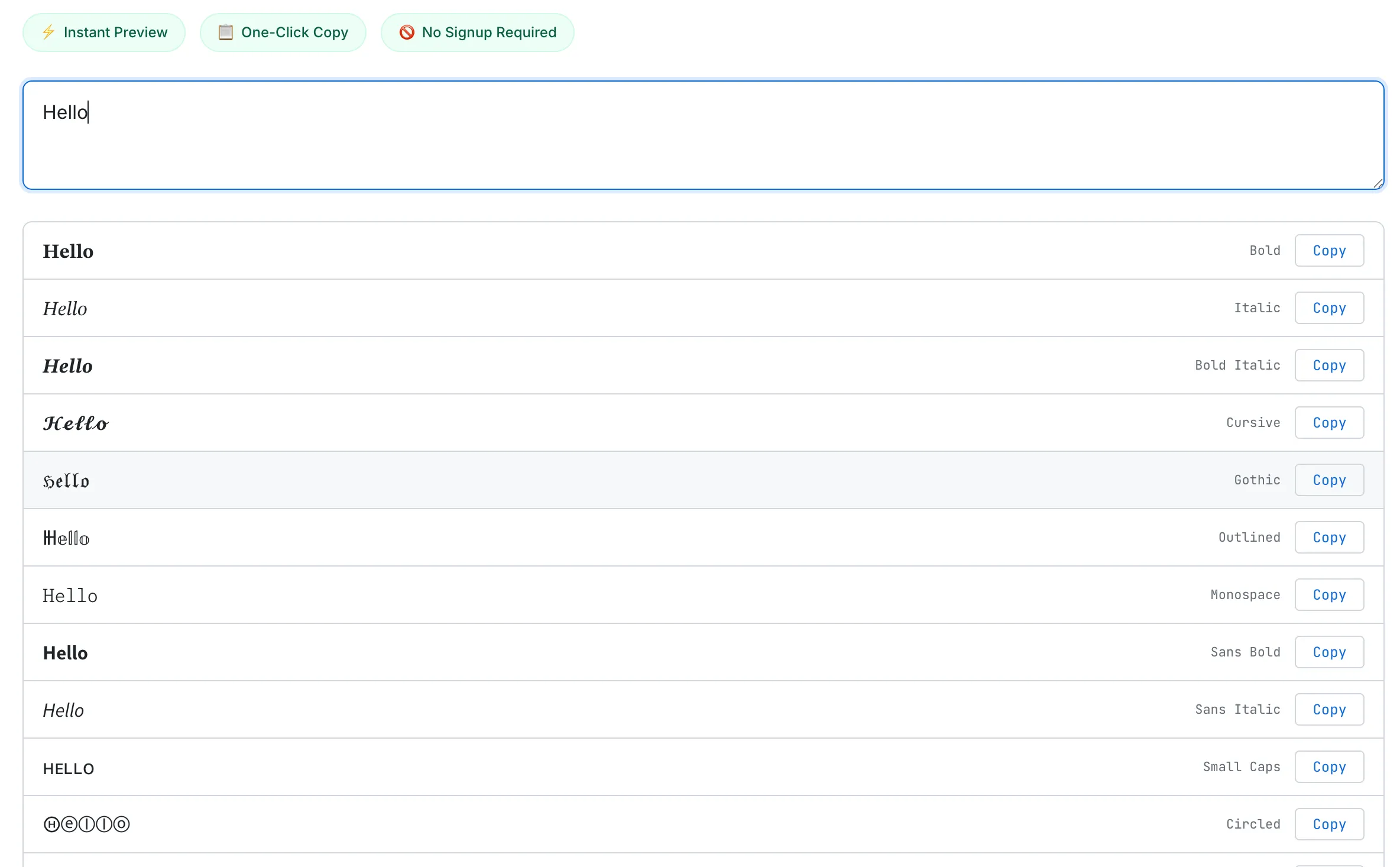
Type once, see every style at a glance. Each row has its own Copy button — no text selection needed.
I chose a list over a card grid because of information density. Cards have padding, margins, and borders that limit you to 6–9 per screen. A list shows 15–20 in the same space. One or two scrolls and you've scanned all 40 styles.
The Small Things
The details that don't stand out visually but define the experience.
Default preview. Before you type anything, "Hello World" is already applied to all 40 styles. You can browse every style before typing a single character. Most competitors show a blank screen until you start typing.
No Generate button. All 40 styles update instantly as you type. Unicode character mapping is computationally trivial — just string iteration and code point arithmetic — so there's no debounce. Every keystroke triggers an immediate update with zero perceptible delay.
Event delegation. I didn't attach 40 separate event listeners to 40 Copy buttons. A single click listener sits on the results container and identifies which button was clicked using a data-idx attribute. One listener instead of 40, better memory efficiency.
Copy feedback. When you click a Copy button, the text changes from "Copy" to "Copied!" and the button turns green. A toast notification at the bottom of the screen confirms what was copied ("Copied Bold to clipboard") and disappears after two seconds. You never have to paste somewhere else just to verify the copy worked.
Mobile adaptation. Below 480px, the style name label is hidden. On a narrow screen, a long name like "Strikethrough" doesn't need to take up space. The converted text and the Copy button are all you need.
What I'd Add Next
There are features I deliberately left out that I'd revisit once the tool has enough traffic to justify them.
Drag-and-drop reordering. Let users drag their frequently used styles to the top and save the custom order in localStorage. This only makes sense when there are enough returning visitors to benefit from personalization. Right now, most visits are one-time, so the investment-to-impact ratio is too low.
Individual style pages. Subpages like /tools/fancy-text-generator/cursive and /tools/fancy-text-generator/gothic would capture long-tail keywords like "cursive text generator" and "gothic text generator." Each page would include an explanation of the Unicode block behind that style, usage examples, and platform compatibility notes — useful both for SEO and for users who want to understand what they're copying.
For a deeper look at the Unicode technology behind this tool — how Mathematical Alphanumeric Symbols work, the accessibility implications, and security risks of lookalike characters — read our guide: How Fancy Text Generators Work (Unicode Explained). If you're interested in other text tools, the Word Counter dev log covers a similar "why build another one when so many exist?" story.
The Takeaway
A fancy text generator is one of the simplest tools on the internet. It replaces characters with other characters. That's it. But making a simple task feel simple is harder than it looks.
Dumping 50 styles onto a page without copy buttons is easy. Showing 40 styles in a compact list where any one of them is one tap away from your clipboard is a different problem. Adding features is the obvious instinct. But this project reminded me — again — that removing features often makes a better tool.