Building a Salary Visualizer Where Comparison Is the Hero
Most salary calculators show you a number. I built one that shows you a gap — racing your earnings against Jeff Bezos in real time — and makes it impossible to look away.
The Original Plan Was a Salary Breakdown Tool
The Salary Visualizer started as a straightforward idea: enter your annual salary, see it broken down per second, per minute, per hour. A live counter would tick up showing how much you have earned since opening the page. Below that, purchase power comparisons — how many coffees, Big Macs, iPhones your salary buys. Then a "Time to Earn" section showing how long you have to work to afford specific items. Nice feature list. Clean concept.
Then I asked myself a question that changed the entire project: "Would I share this?"
The honest answer was no. $75,000 ÷ 365 ÷ 24 ÷ 3,600 = $0.0024. You see the number, you think "huh, interesting," and you close the tab. A live counter ticking up by fractions of a penny is not something anyone watches for more than ten seconds. Seven features on a page mean nothing if the first three seconds do not produce a reaction worth sharing.
I needed to rethink the entire approach.
What Viral Income Visualization Tools Have in Common
Before changing direction, I studied the income visualization tools that actually went viral.
Neal Agarwal's "Printing Money" shows a money printer running at the speed of various wages. At minimum wage, bills trickle out slowly. At a Fortune 500 CEO's compensation, the screen floods with cash. Fast Company covered it under the headline "The world's most depressing data visualization? Your salary." One reviewer wrote: "Never before have I seen the difference between the 1% and the other 99% articulated so clearly."
"Spend Bill Gates' Money" lets you try to burn through $100 billion on luxury items. It has over 500,000 mobile downloads. The insight is simple: the impossibility of spending that much money is something you have to experience yourself to believe.
Matt Korostoff's "Wealth, shown to scale" maps wealth to horizontal distance at a scale of 1 pixel per $1,000. The average American's lifetime earnings — about $1.7 million — is a small blue rectangle near the start. To reach Jeff Bezos's wealth, you scroll and scroll and scroll. The page never seems to end.
All three tools do something fundamentally different from a salary breakdown. They do not show you a number. They make you feel a gap. The printing speed difference, the futility of spending, the endless scroll — each creates an emotional response that a raw dollar figure never could.
The psychology backs this up. Leon Festinger's social comparison theory (1954) established that people evaluate their own abilities and standing by comparing themselves to others, especially when objective standards are unavailable. A cross-national study by Sweeney and McFarlin (2004), examining samples from 12 countries, found that three different types of pay comparisons independently predicted pay satisfaction — even after controlling for actual pay levels. Translation: how much you earn matters less than how you think you compare.
That was the pivot. Comparison had to be the hero, not a supporting feature buried below the fold.
Putting Comparison First
The original layout: Input panel → Live counter → Breakdown table → Purchase power → Billionaire comparison → Share
The new layout: Live comparison (You vs Bezos) → Input panel → Breakdown → Purchase power → Share
The change was not just about order. Comparison became the reason the page exists.
When you open the page, the counter starts immediately with a default salary of $60,000 — close to US median individual earnings. No setup required. On the left: "You: $0.00." On the right: "Jeff Bezos: $0.00." Both numbers tick up every 250 milliseconds. Within three seconds, the gap is visible.
$0.02 vs $930.
That is the first thing you see. That is the screenshot moment. If you want to enter your own salary, a "Change salary" button scrolls you smoothly down to the input panel. The key principle: the default experience must produce a reaction before the user touches anything.
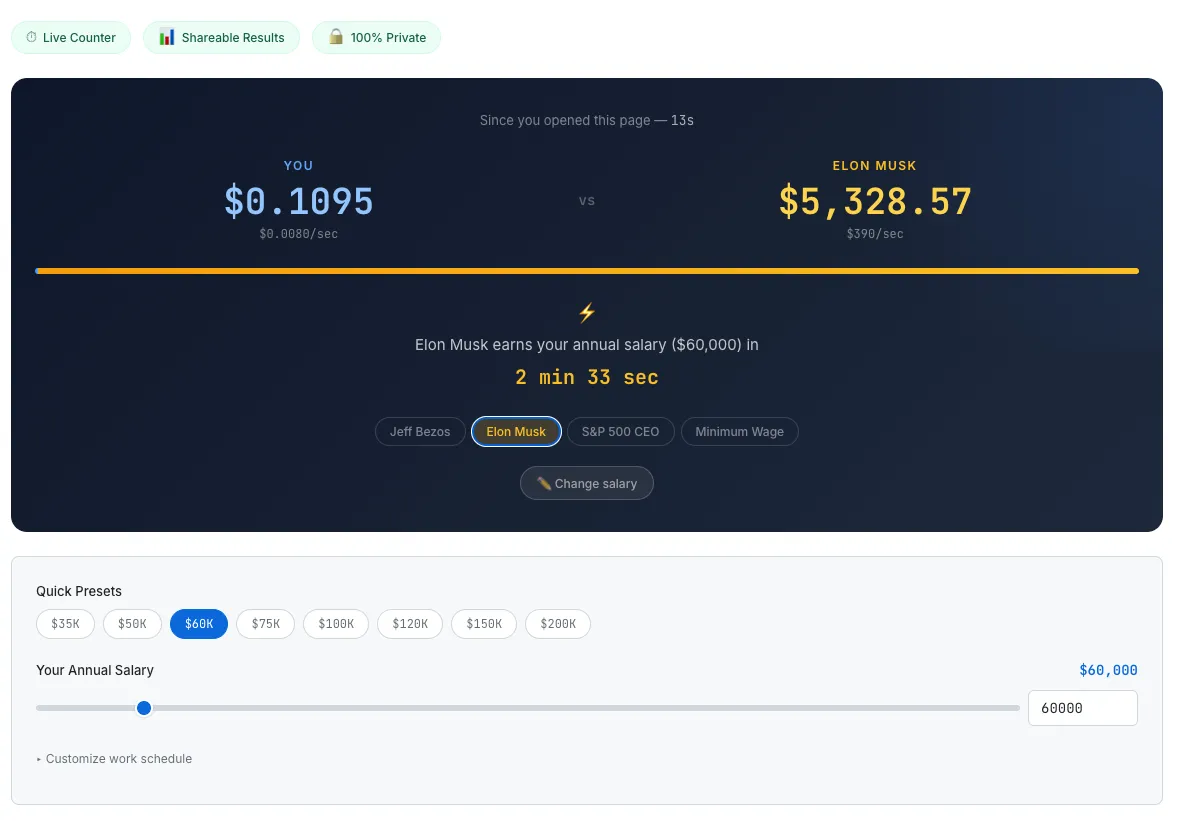
The hero comparison section. Two counters racing in real time, a ratio bar, and the shock statistic.
The Dual Counter — A 250ms Real-Time Race
The real-time counter reuses the pattern I validated in the Meeting Cost Calculator: setInterval at 250 milliseconds combined with wall-clock time calculation.
Every tick, elapsed time is computed as Date.now() - startTime, not by counting intervals. This matters because setInterval only guarantees a minimum delay, not precision. When a tab goes to the background, browsers throttle timers. Wall-clock calculation is immune to this drift — when you switch back, the counter shows the correct elapsed amount instantly.
The user's per-second rate is calculated from their annual salary divided by working seconds per year. At $60,000 with a standard schedule (8 hours/day, 5 days/week, 52 weeks), that is 7,488,000 working seconds, yielding about $0.008 per second.
Bezos is estimated at roughly $310 per second based on annual wealth growth. Both counters run simultaneously against real elapsed time. A ratio bar updates in real time — the user's portion is 0.003%, a sliver of blue barely visible against the gold bar. This visual device communicates inequality more viscerally than any number.
For context: the CEO-to-worker pay ratio has grown from about 31:1 in 1978 to 281:1 in 2024, according to the Economic Policy Institute. CEO compensation increased 1,094% over that period. Worker compensation increased 26%. Reading those statistics is one thing. Watching two counters race is another.
The Shock Statistic — "3 Minutes 13 Seconds"
The most shareable piece of information on the page is not the counter itself. It is this single line:
"Jeff Bezos earns your annual salary ($60,000) in 3 min 13 sec"
The math is straightforward: salary / target.perSecond. $60,000 ÷ 310 = 193.5 seconds. Three minutes and thirteen seconds.
This line works because it is specific and personal. Everyone knows Bezos is richer. "Three minutes and thirteen seconds" is a new way to feel that fact. And the salary in the sentence is the one the user entered themselves — it is not a generic statistic. It is about their money.
The tool offers four comparison targets, each producing a different emotional response:
- Jeff Bezos ($310/sec, est. wealth growth) — The classic comparison. Extreme gap. Pure shock.
- Elon Musk ($2,700/sec, est. wealth growth) — Even more extreme. At $60,000, Musk earns your annual salary in 22 seconds. Twenty-two seconds.
- Avg S&P 500 CEO ($2.52/sec, based on $18.9M avg compensation per AFL-CIO) — Closer to reality, which makes it more infuriating. Your annual salary in about 6 hours and 36 minutes.
- US Minimum Wage ($7.25/hr) — The comparison flips. The user earns more. The stat changes to "You earn 4.0x the Minimum Wage rate." Same UI, completely different emotion — gratitude, relief, or discomfort.
That last switch gives the tool depth. It is not just about feeling small next to billionaires. It is about understanding where you stand in a wider spectrum.
Making Numbers Tangible — Purchase Power and Time to Earn
Below the comparison hero, two supporting sections translate salary into things you can touch.
"Your Salary Buys..." converts annual income into everyday items: 40 coffees per day, 206 Big Macs per week, 50 iPhones per year, 7 years to buy an average US home. The Economist's Big Mac Index has been a viral reference since 1986 for exactly this reason — abstract numbers become concrete when attached to a cheeseburger.
"Time to Earn" reverses the perspective. Instead of what your salary buys, it shows how long you work to afford each item. A cup of coffee: 12 minutes. An iPhone 16 Pro: 41 hours. A Tesla Model 3: 121 days. An average US home: 5.8 years. There is also a custom price input — type any dollar amount and see it converted to working time instantly. This small interaction is what makes people type in their rent, their car payment, their student loan balance. It creates a personal moment that drives return visits.
The Share Card — Canvas API for Viral Distribution
The final requirement for virality: sharing must be frictionless.
The tool generates a 1200×630 PNG image entirely on the client using the Canvas API. Dark gradient background. The user's rate on the left in blue. The comparison target's rate on the right in gold. The shock statistic in large text at the center. The SudoTool URL at the bottom as a watermark.
No server involved. No salary data leaves the browser. The image is generated locally and downloaded or shared directly. Pre-written share text is optimized for Twitter/X and LinkedIn:
"My salary = $0.008/sec. Jeff Bezos = $310/sec. He earns my annual salary in 3 min 13 sec. Check yours →"
Copy, Tweet, LinkedIn, and Download buttons sit directly below the result card. The goal: when the user feels the impulse to share, there should be zero friction between that impulse and the action.
Shopify proved this principle at scale. When they embedded a meeting cost calculator into their company calendar — making the dollar cost of every meeting visible in real time — they freed 322,000 hours of meetings and eliminated 474,000 calendar events across 2023. Making cost visible changes behavior. Making income gaps visible changes conversations.
Milestone Toasts — Keeping Users on the Page
The longer someone stays on the page, the more likely they are to share. Milestone toasts are a lightweight gamification layer borrowed from the meeting cost calculator.
When the live counter crosses $0.01, a toast notification slides in: "Your first penny since opening this page!" At $1: "You've earned a dollar!" At $5: "That's a coffee!" At $100: "$100! That's a shopping spree." Each milestone triggers a subtle bounce animation on the user's counter.
These are small rewards, but they plant a question: "How long until the next one?" That curiosity adds seconds, then minutes, to page dwell time.
What I Would Build Next
Several features did not make v1:
- Global income percentile — "You are in the top X% of the world's population." Earning less than Bezos but still being in the global top 1% is a powerful and shareable fact.
- "What if" mode — Scenario comparison for salary negotiations. "If I get a $10K raise, my per-second rate changes from $X to $Y."
- Coin drop animation — CSS-animated coins falling into a jar. Fun but needs more performance testing before shipping.
- Embeddable widget — A mini version that other sites can embed via iframe. Good for backlink strategy.
Global income percentile is first on the list. It adds another shareable moment without adding complexity to the core experience.
The Takeaway
The salary breakdown tool I originally planned was not a bad tool. It had features, it had accuracy, it had depth. But nobody would have shared it.
Every viral income visualization tool I studied succeeded by doing one thing well: making a gap feel real. Neal Agarwal's printer shows the speed gap. Korostoff's scroll shows the distance gap. Shopify's calculator shows the cost gap. All the same principle.
$0.008 per second is information. $0.008 per second racing against $310 per second is emotion. People do not bookmark information, but they share emotion.